I couldn’t help myself, the words just tumbled out in, “Karen, please let me re-hang your pictures!” My senses were jarred by the chaotic arrangement in front of me – horse paintings, prints and photos (beautiful though they all are) hung in disparate groupings, at different heights, with random hooks. In short, her collection of hunt prints, dressage photos, a prize blue ribbon and an abstract painting here and there couldn’t be appreciated through the confusing assemblage. Each piece cried out to take center stage but couldn’t, so the room seemed cluttered and messy. It was time to sort the wall out!
To my fellow hoarders of equine art & artifacts, here are a few designer tips for displaying your collection in a pleasing fashion.
First, Rein in your desire to hang pictures too high. Art should be hung at eye level. When hanging a grouping the center point should be at eye level. Take a moment and decide the feeling you want when you walk into the space. If the room is bathed in soothing, neutral colors with sleek monotone contemporary furniture, a loud painting with bold colors could either become a lively focal point or disrupt the calm nature of the space depending on what feeling you are trying to convey.
The same rules apply to making a room feel formal or more on the casual side. Vertical lines in art are great for giving the illusion of height in a space and look refined, whereas horizontal lines will widen a space and will create a more casual scheme.
If you are tech savvy (and if not ….get some kid who is about 12 years old as a consultant to do it for you…Ha!), experiment with the layout. You can use Paint software to drag pictures into a layout before you commit to putting in the first nail hole in the wall.
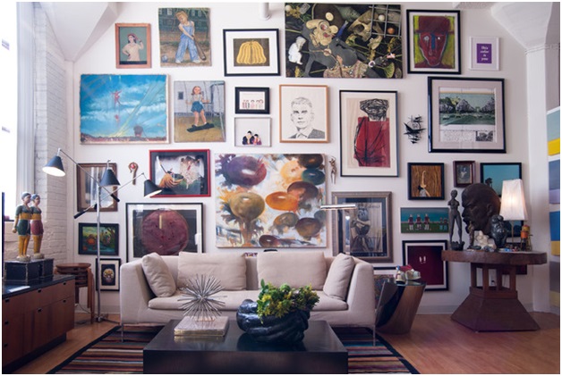
Stirrup the look…add some surprise pieces to the art grouping. Some people love a symmetrical grouping but remember, that symmetry also adds an element of formality to the room. An updated look that’s become popular in salon installations is to cluster disparate images or frames together. There is no right or wrong way to do it, just experiment and choose what looks best to your eye. Let the proportions and scale dictate whether that picture of your first horse should be next to the photo of a cool barn. No matter what placement you choose, remember to start in the middle of the wall and work your way out.
Give old notions of hanging equine art “the boot”.
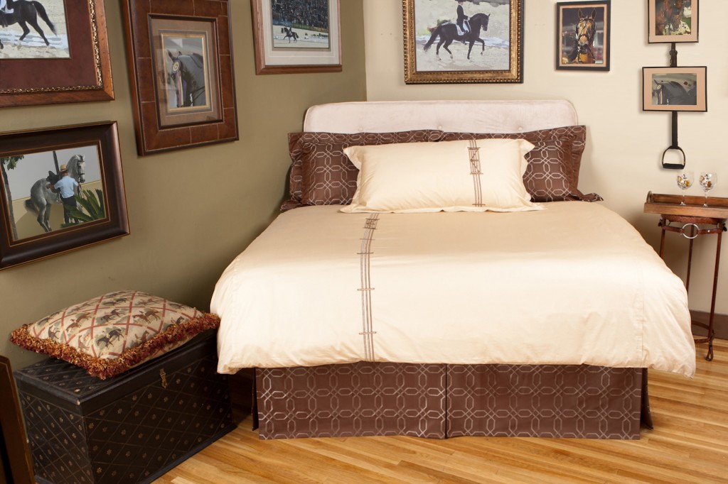
A good example of this is the Stirrup Leather Nail-less Picture Hanger. Transforming a stirrup and leather into a wall hanger not only adds a whimsical touch to your equine art, but can be removed easily from your living room wall and hung just as easily on the wall of your tack room at your next horse show.
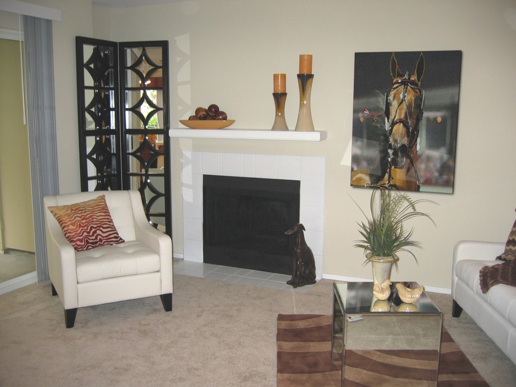
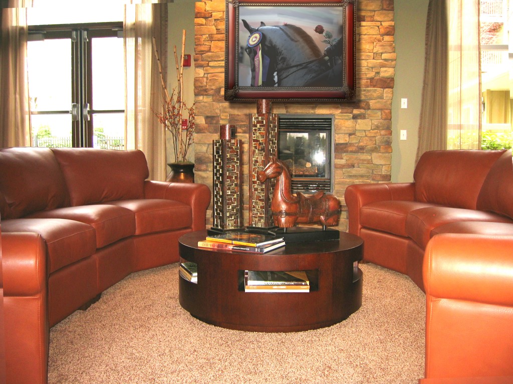
Remember that when hanging art above a furniture piece, try not to hang anything higher then 3-6” since the eye will focus on the wall rather than your print.
Designers often go by the rule of thumb that artwork is about 2/3 –3/4 the length of the furniture over which it hangs, but that is not always the case anymore. To give a more eclectic look, an art piece larger than the furniture is acceptable ….the key is visual weights, a concept that creates symmetry, balance, and harmony in design. Visual weight helps guide the viewer’s attention to the piece we want them to see. Visual symmetry and design harmony relies on how visual weight factors in concert with each other. For example, hue or color affects visual weight with a color such as red drawing more attention than say a pale green.
Out on a Ledge
If you like to change your artwork frequently, or prefer a more casual, hip vibe, a ledge is an ideal choice or just or just lean the art against the wall.
Now, to play with some or all of these tips, take a moment to group the pieces you feel can actually work together.
When you finally decide the grouping, it’s time to make those nail holes!
1. Hold frame flat against wall. Using a pencil, mark on the wall the top center point of the frame.
2. Turn frame over and measure down from top to where hook or wire is on back.
3. Measure this same distance down from your pencil mark on the wall and place an x. This is where your hook should go.
So quit stalling around and have some fun giving your old memories a proper place in your home.
Mary Cox is an equestrian interior designer who has accumulated a ridiculous amount of tack. She welcomes your ideas and creative solutions for using all that tack. Contact her via her website Horse of a Different Color @ www.equestrian-interiors.com (where you can also view videos of these projects, and more). Mary’s blog at www.blog/equestrian-interiors.com features fun ideas and resources on equestrian home décor. The majority of art & the Stirrup Leather Nail-less Picture Hanger depicted in this article are from Elizabeth Shatner’s Equine Art Collection.


